Rushing's Rarities and Designs
Logo and Branding
Rushing's Rarities and Designs is a division of William Rushing Art in which I create props and Gaffs in the style of P.T. Barnum or Ripley's Believe it or Not. the designs below are intended to instill a sense of wonder and whimsy while harkening back to designs of the victorian era.
Graphic Products / DuraLabel
A leader in Safety Labeling solutions, Graphic Products, known to consumers as DuraLabel, provides versatile label printers, supplies, and signage.
Working within their brand standards, Rushing Art creates documents, publications, advertisements, and product packaging.
DuraLabel produces many publications which provide the information necessary to take action on safety labeling. These documents help to establish DuraLabel as an authority in Safety Labeling as well as aid in making their chosen industry safer for their customers. The example to the left is an “Instant Action Guide” for the requirements necessary for labeling electrical equipment at risk for Arc Flash, as well as the equipment needed to protect the workers who service those devices.
Jack Adams USA
Jack Adams USA is a Men’s underwear and activewear brand located in the Pacific Northwest. Their brand markets to men in athletics often body building and focuses on the fit and quality of their garments.
Their aesthetic is intended to mirror those qualities, and centers on modern, clean design. Beginning with a redesign of their Look Book Catalog, Rushing Art’s partnership with Jack Adams has provided them with eye catching feature Graphics, Product Callouts and even Fabric Patterns.
Double U, LLC
Double U, LLC is an online retailer who mostly sells GPS tracking equipment for Hunting dogs and self branded apparel. When I was hired on at Double U there was an established logo and the beginnings of a color scheme but not much else in the way of identity or branding. Since then I have established a unified identity and helped to solidify their brand as the top hound hunting supply company in the US.
The identity I've established for Double U extends from their website, to their mobile site and across all of their printed ads. I've designed apparel, vinyl decals, Houndsmen Magazine (a 68 page semi annual magazine and catalog) and even a truck wrap.
Houndsmen Magazine
When I started at Double U, LLC I was asked to design a Magazine with a product catalog to be released on a semi annual basis. After establishing an identity for the company, I pulled that over to build the magazine.
NHTDA.org
Branding
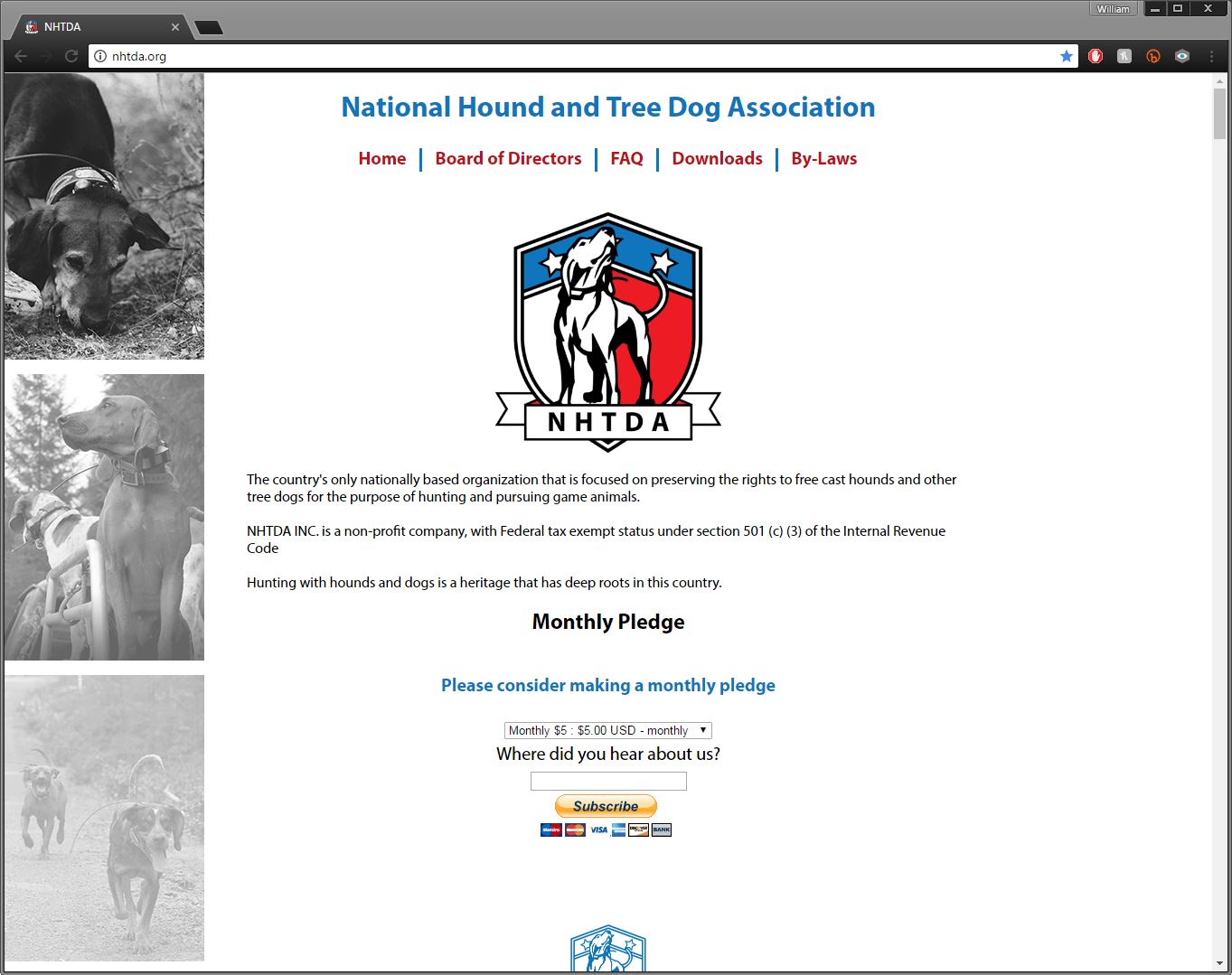
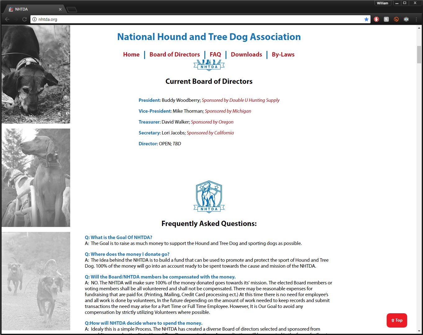
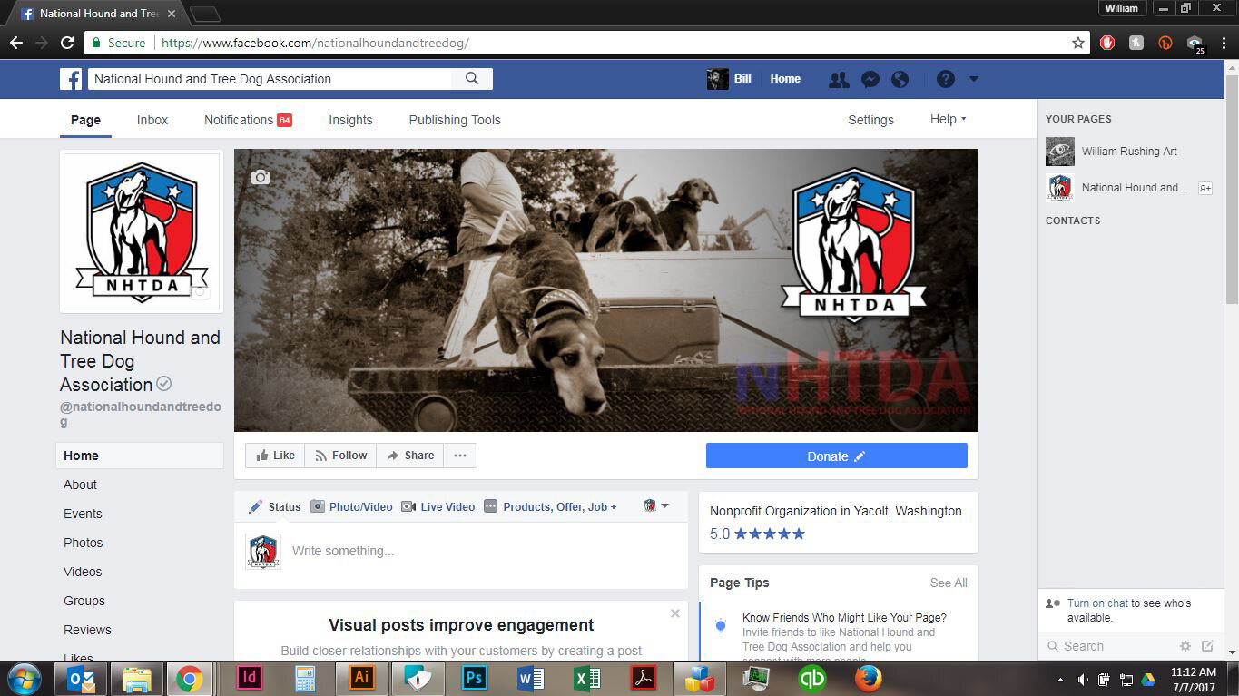
The National Hound and Tree Dog Association is a newly formed group of state organizations that come together to raise funds to be used for the preservation of the recreational and professional training and use of hounds and working dogs.
From the logo and their donation forms, to the hand coded website and Facebook page, every aspect of this identity is meant to evoke strength and national cooperation.
Retribution; Mead Bottle Label
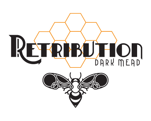
This label was designed as a case study, my goal here was to design a label for a bottle of alcohol that evoked the prohibition era while maintaining a modern feel. I achieved this by designing a typeface that had a Playbill feel and using crisp even strokes.
Package label redesign for Farm & Market
Farm & Market Gourmet Chicken Sausage
For this project I was supplied with an existing label and tasked with redesigning it using the existing assets. The client’s main concern was to brighten up the design and make it more crisp and clean.


